If you're looking for an effective way to present data in a visually stunning manner, creating Donut Charts In Tableau is the perfect solution. With Tableau's powerful tools, creating them is easier than ever before! In this blog post, we'll be exploring how to create stunning donut charts in Tableau that are sure to wow your audience
We'll kick off with some of the basics, such as understanding what a donut chart is and how it differs from other visualizations.
Prerequisites for setting up Doughnut Charts in Tableau

Creating stunning donut charts in Tableau is easy when you know the right steps to take. The following prerequisites will ensure that your doughnut chart looks its best:
1. Choose the right data source. Doughnut charts are well suited for data that can be represented in a pie chart, such as percentages or parts of a whole. Consider using a different chart type if your data doesn't fit this description.
2. Format your data correctly. Doughnut charts require two columns or rows of data: one for the labels and one for the values. Make sure both sets of data are in the correct format before proceeding.
3. Connect to your data source. Select "File > New > Data Source" in Tableau from the menu bar. Select the appropriate connection type for your data source and follow the instructions to connect to your data.
4. Build your doughnut chart. From your data source, drag the "Label" field to the "Columns" shelf and the "Value" field to the "Rows" shelf. Then, select "Pie" from the drop-down menu next to "Value." Lastly, drag "Label" onto the "Color" mark card to complete your doughnut chart!
What is Tableau?

This software allows you to view and understand data in a new way using business intelligence and data visualization. With Tableau, you can explore and analyze data without having to write any code.
Tableau is easy to use and provides various options for visualising your data. You can create stunning donut charts in Tableau that will wow your audience.
1) Tableau Desktop

You can create stunning donut charts with Tableau Desktop, a powerful data visualization tool. You can create a donut chart in Tableau Desktop by following these steps:
1. You can connect to any data source using Tableau Desktop.
2. Navigate to the worksheet where you want to create the donut chart.
3. The dimensions and measures that you want to use for the donut chart can be selected here. Our measure will be "Sales" in this example, while our dimension will be "Region".
4. Drag the dimension and measure fields into the "Rows" and "Columns" shelves, respectively.
5. From the Marks card, choose the "Pie" mark type.
6. From the Marks card to the "Color" shelf, drag the "Region" field. This will colour each pie slice by region.
7. Hover over one of the pie slices and select the menu icon (the downward-facing arrow). From the menu, select "Format".
8. From the dropdown menu under "Chart Type," choose "Donut" in the Format pane.
9. Adjust any other options as desired, such as title, labels, etc., then click "OK".
10. Your donut chart is now complete!
A) Tableau Desktop Personal
If you want to take your Tableau skills to the next level, then learning how to create stunning donut charts is a must. And, with Tableau Desktop Personal, it's easy to do just that.
Tableau Desktop Personal is a great way to learn how to create donut charts that will wow your audience. The software makes it easy to create beautiful charts and visualizations, and the built-in tutorials make it easy to get started.
Plus, with Tableau Desktop Personal, you can practice creating donut charts on your own time, so you're ready to impress your boss or clients when they see your work.
So, if you're ready to learn how to create amazing donut charts in Tableau, then Tableau Desktop Personal is the perfect tool for you.
Download it today and start creating stunning donut charts in no time!
B) Tableau Desktop Professional
Tableau Desktop Professional is an effective data visualisation tool that can assist you to create stunning donut charts that will wow your audience. It's easy to use and has a wide range of features, making it the perfect choice for creating complex data visualizations.
You can quickly and easily connect to your data sources with Tableau Desktop Professional and begin creating stunning donut charts. The drag-and-drop interface makes it easy to add or remove elements from your chart, and you can customize the appearance of your chart to match your brand or style.
Tableau Desktop Professional also offers a wide range of advanced features for more complex data visualisations, including:-
- Hierarchical views: Allows you to see how your data is organised by nesting different levels of detail within each other. This is perfect for seeing relationships between different data points.
- Filters: Lets you focus on specific parts of your data by filtering out unwanted information. This is especially useful when dealing with large datasets.
- Calculations: Gives you the ability to create new fields based on calculations from existing fields. This is great for performing statistical analysis or creating custom metrics.
2) Tableau Public

It is a Public, free application online platform which allows users to create stunning visualizations with ease. In this article, we will show you how to create donut charts in Tableau Public that will wow your audience.
Donut charts are those kinds of pie charts that can be used to display data in a more visually appealing way. They are especially useful for displaying hierarchical data or data that has multiple levels.
Creating a donut chart in Tableau Public is easy. Simply select the "Pie Chart" option from the "Visualization" menu and then choose the "Donut" chart type.
Once you have created your donut chart, you can customize it to better suit your needs. For example, you can change the colours, add labels, or even add a title.
Tableau Public also allows you to share your donut charts with others. Simply at the top of the page, click the "Share" button on your visualization and you can easily share a link with others or embed it in a website.
Donut charts are great for displaying data in an eye-catching way. With Tableau Public, creating these charts is quick and easy.
3) Tableau Server
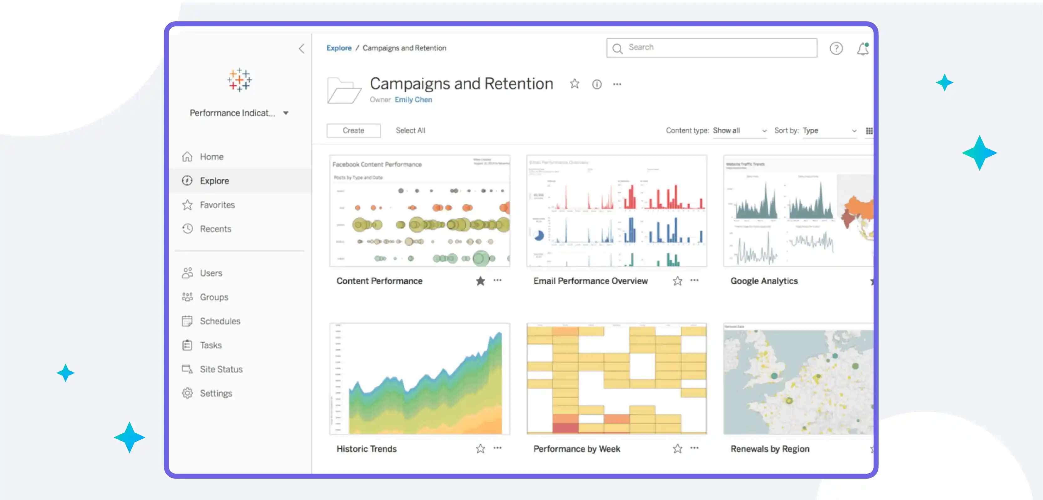
Tableau Server is one of the most popular data visualization tools available today. And for good reason - it's powerful, easy to use, and produces stunning visualizations that can help you better understand your data.
Tableau Server is an enterprise-level analytics platform that allows organizations to securely store and share their data. It also provides tools for managing user access, creating visualizations, and publishing dashboards.
With Tableau Server, organizations can quickly create interactive dashboards that enable users to explore and analyze data in real time.
Tableau Server also supports scalability and high availability, allowing you to easily scale up or down as the needs of your business change. Plus, it integrates with popular BI solutions such as Salesforce and Google Analytics, making it easy to connect all your data sources in one place.
Tableau Server is a great tool for organizations of all sizes who are looking to take their data analysis to the next level. Whether you're a small business, an enterprise, or somewhere in between, Tableau Server can help you unlock the insights buried in your data.
4) Tableau Online

Tableau Online is a cloud-based data visualization tool that helps you easily create stunning donut charts. It offers a wide range of features and options that allow you to customize your charts to suit your specific needs. Using the Tableau Online Public Gallery, you can also share your charts with others.
Tableau Online also provides a range of visualization templates to help you quickly and easily create beautiful donut charts. You can also use the drag-and-drop functionality to customize your charts with different colours and labels.
With Tableau Online, you can export your donut charts in various formats including PDF, SVG, JPG, PNG, and HTML.
Tableau Online also allows you to leverage powerful analytics and data blending capabilities to gain better insights from your data. Finally, Tableau Online provides a secure and reliable environment for creating and sharing your donut charts with the world.
5) Tableau Reader

It is a free desktop application that you can use to open and view Tableau workbooks. The tool is not as powerful as Tableau Desktop, However, it is an excellent way to share your work with others who do not have the tool installed.
Follow these steps to create a donut chart in Tableau Reader:
Step 1. Launch Tableau Reader and open your workbook.
Step 2. Choose the sheet containing the information for your donut chart.
Step3. Click the "View" button in the toolbar.
Step 4. Select "Show Me" from the drop-down menu.
Step 5. Click the "Pie Chart" option from the list of charts that appears.
Step 6. Drag the field that you want to use for your donut chart into the "Color" shelf.
Step 7. Drag the field that you want to use for your donut chart into the "Label" shelf (optional).
Step 8. At the bottom of the "Show Me" window, click the "Apply" button.
Key features & benefits of Tableau
When it comes to data visualization, Tableau is one of the most popular tools on the market. And for good reason: Tableau is incredibly powerful and versatile, allowing users to create a wide variety of charts and visualizations.
One of the most popular types of charts in Tableau is the donut chart. A variety of data points can be displayed using donut charts, which are a fantastic tool for data visualization. Moving forward we’ll show you how to create stunning donut charts in Tableau that will wow your audience.
With Tableau, you can quickly and easily create complex charts and visualizations. The software is easy to use and has a wide range of features, making it a great choice for data visualization.

Some of the key features and benefits of using Tableau include:-
1) Collaboration and Sharing:
Tableau allows you to easily collaborate with your team, share data, and create visualizations together.
With the help of Tableau, users can quickly and easily create beautiful donut charts. The ability to share and collaborate on Tableau projects makes it an ideal tool for both individual and team-based work.
- The capability of quickly establishing connections to data sources, such as Excel, CSV, and JSON files.
- A drag-and-drop interface that makes creating charts and visualizations easy
- The ability to share projects with others for collaboration and feedback
- Donut charts are among the many different types of charts that are offered.
Donut charts are a great way to visualize data visually appealingly. Using colors and labels makes it easy to see patterns and trends in the data. Tableau’s donut chart functionality makes it easy to create these types of charts, without the need for any coding or design experience.
2) Maps
Tableau makes it simple to create maps, which is a fantastic way to visualize data. You can use maps to show data by location, compare data across different regions, or even show how data has changed over time.
Tableau makes it easy to add additional information to your maps, such as labels, tooltips, and legends. You can also customize the appearance of your maps, including the colours and styles of the map elements.
Tableau’s mapping capabilities are not just limited to geographical data – you can also create “heat maps” which show the density of data points, or “flow maps” which show the movement of data between different locations.
3) Robust Security
A strong security model is provided by Tableau, a potent tool for data visualization, to help keep your data secure. Tableau's security features include:
- User authentication: Tableau Server can be configured to use Active Directory or LDAP for user authentication. This ensures that only authorized users have access to your data.
- Data encryption: Tableau Server supports SSL encryption for all communication between the server and client applications. This helps protect your data from being intercepted and read by unauthorized individuals.
- Row-level security: Tableau Server supports row-level security, which allows you to control which users have access to which data rows. This is useful for ensuring that sensitive data is only seen by authorized users.
- Role-based permissions: Tableau Server supports role-based permissions, which allow you to control what users can do with the data they can see. For example, you can give certain users the ability to edit data, while others can only view it. This helps ensure that your data is used appropriately and doesn't get accidentally corrupted or deleted.
4) Data Sources
Tableau is an effective tool for data visualization that can assist you in seeing and comprehending your data in novel ways. Tableau can connect to many different types of data sources, including Excel, CSV, and JSON files.
Tableau makes it easy to work with large amounts of data. You can quickly filter and group data to find the information you need. Tableau also has built-in calculations that can help you analyze your data.
Tableau is highly customizable. You can change the colors, shapes, and sizes of your visualizations to make them more visually appealing. You can also add interactivity to your visualizations so that your audience can explore the data more deeply.
5) Ask Data
Some of the key features and benefits of using Tableau include:
- The ability to ask data questions in natural language and get answers in real time. This is a huge benefit for those who are not as familiar with data analysis or for those who want to quickly get an answer to a question without having to go through a lot of data themselves.
- A visually appealing interface that makes it easy to understand the data. Tableau’s drag-and-drop functionality also makes it easy to create charts and visualizations, even for those unfamiliar with design.
- The ability to easily share visualizations with others, either through the Tableau Public platform or by embedding them on websites or blogs. This is a great way to communicate data findings with a wider audience.
What is a Doughnut Chart in Tableau?

In a doughnut chart, each data point is represented by a ring or "donut" rather than a slice, similar to how slices are used to represent data in pie charts. Doughnut charts are typically used to compare proportions or percentages and can effectively convey data when used judiciously.
While doughnut charts have their place, it's important to use them sparingly and with caution, as they can easily become overloaded with too much information or be difficult to interpret. When used correctly, however, doughnut charts can be powerful tools for visualizing data.
Tableau provides several options for creating doughnut charts, including adding labels, adjusting each ring's size, and controlling the overall chart design. To create a doughnut chart in Tableau, users can select “Pie Chart” from the Show Me tab, then click on “Donut” to switch the chart type.
Benefits of using Doughnut Charts in Tableau
In Tableau, doughnut charts are a fantastic way to display data visually. They can be used to show overall trends or compare different data groups. Doughnut charts are also easy to create and can be customized to fit your specific needs.
Some benefits of using doughnut charts in Tableau include:
- They are visually appealing and can help make complex data sets more digestible for audiences.
- They effectively utilize space, as multiple series can be displayed within a single chart.
- They can be easily customized to change colours, labels, and other elements as needed.
- They can be combined with other chart types to give more detailed insights.
- They are great for creating interactive dashboards, as viewers can easily drill down into specific categories.
- They are helpful for making clear comparisons between various categories or subsets of data in a way that is easy to understand.
- They are a great way to represent data in a meaningful way visually.
Drawbacks of Using Doughnut Chart in Tableau
When it comes to data visualization, there are many different ways to present information. One popular method is using a doughnut chart. While doughnut charts can be effective in some situations, there are also some drawbacks that you should be aware of before using one in your next Tableau project.
One potential drawback of using a doughnut chart is that it can be difficult to compare values. This is because the value labels are often located outside the chart, making it hard to see the differences at a glance.
Additionally, if you have a lot of data points, the labels can become cluttered and difficult to read.
Another downside of doughnut charts is that they can be misleading when showing proportions. This is because the size of each section is not necessarily proportional to the other sections.
For example, if you have two sections that are both 50% of the total value, one will appear much larger than the other on the chart even though they are equal in size.
Finally, doughnut charts are also limited in terms of the number of data points they can show. While they are effective for showing a handful of values, they become cumbersome when more than five or six values are displayed. In these cases, bar graphs or other types of charts may be more appropriate.
Overall, while doughnut charts have their uses in Tableau, it is important to be aware of their limitations before using them in your projects.
Doughnut Chart vs Pie Chart: What’s the difference?

There are a few key differences between doughnut charts and pie charts that are important to note when choosing which type of chart to use for your data.
Doughnut charts are better suited for displaying multiple data series, as each series can have its ring. Pie charts, on the other hand, are better suited for displaying a single data series.
Doughnut charts also can show how different parts of a whole interact with each other, whereas pie charts do not.
Finally, doughnut charts tend to be more visually appealing than pie charts, making them more likely to capture and retain your audience’s attention.
1) Usage
In general, doughnut charts are better for comparing parts of a whole, while pie charts are better for showing proportions. However, there are cases where either chart type could be used.
Doughnut charts show how a whole is divided into different parts. Each ring in the chart represents a different category, and the size of the ring corresponds to the proportion of that category in the whole. For example, a doughnut chart could be used to show how a company's sales are divided among its different product lines.
Pie charts demonstrate the division of a whole into its component parts, but each slice of the pie stands for a distinct category. The slice size corresponds to the proportion of that category in the whole. Pie charts often show how something is divided among different groups, such as how voters cast their ballots in an election.
There are some situations where either type of chart could be used. For example, if you wanted to compare two companies' market shares, you could use either a doughnut chart or a pie chart.
The main difference would be in how the data is presented: with a doughnut chart, each company would have its ring, while with a pie chart, each company would have its slice.
2) Type
Several key differences between doughnut charts and pie charts are important to consider when trying to decide which type of chart is best for your data.
Doughnut charts are better for comparing proportions within a whole, while pie charts are better for showing how parts of a whole compare to each other.
Doughnut charts can have multiple data series, while pie charts are limited to a single series.
Doughnut charts can have multiple levels of nesting, while pie charts are limited to two levels.
Doughnut charts can have gaps between the segments, while pie chart segments will always touch each other.
Doughnut charts can display multiple data rings, while pie charts are limited to one ring.
Finally, doughnut charts have a much wider range of customization options than pie charts, allowing you to adjust the size and colour of segments, as well as add labels and other visual elements to your chart.
3) Comparison
One of the most common questions Tableau users have is whether to use a doughnut chart or a pie chart for their data visualization. While both charts help display data, some key differences between them can help you decide which one is right for your project.
Doughnut charts are better for comparing multiple categories, while pie charts are better for showing proportions. Doughnut charts also have the advantage of being able to show multiple layers of data, while pie charts can only show one.
When it comes to design, doughnut charts tend to be more visually appealing than pie charts. They also take up less space, which can be important when you're working with large data sets.
Ultimately, the decision of which chart to use depends on your data and your goals for the visualization. If you're not sure which one will work best for your project, try creating both and seeing which one communicates your data more effectively.
4) White Space
The biggest difference between donut charts and pie charts is the use of white space. In a donut chart, the centre is left blank, while in a pie chart, the centre is often filled with a label or another data point.
This may not seem like a big deal, but it makes a big difference in how easy the chart is to read and understand. The empty centre of the donut allows for easier differentiation between data points, while the filled centre of the pie can make it more difficult to see patterns.
In addition, because donut charts have less visual clutter, they can be more effective at communicating data. When used correctly, they can help your audience better understand complex data sets.
So, while pie charts and donut charts both serve the same purpose of showing data visually, they’re different enough that you should choose one over the other depending on your specific needs.
How to create a Doughnut Chart in Tableau?
Doughnut charts are one of the most popular ways to visualise data in Tableau. They are especially useful for showing comparisons between different categories.
Creating a doughnut chart in Tableau is simple. First, select the dimension and measure that you want to use. Drag the dimension to the Label shelf and the measure to the Value shelf after that. Finally, click on the Doughnut icon in the Marks card.
Your doughnut chart will now be created! You can further customize it by changing the colours or adding labels. Below are some of the best steps to create a Doughnut chart
Step 1: Set the Base
If you want to create a donut chart in Tableau, the first step is to set the base. To do this, you need to create a calculated field that will be the basis for your donut chart. The formula for this calculation is:
Donut Base = SUM(1/COUNTD([Field])
This will give you a value of 1 for each unique value in the field you are using. For example, if you are using a field with 10 unique values, the Donut Base calculation will return a value of 0.1. This value will be used as the starting point for your donut chart.
Step 2: Put your first feature
you'll need to put your first feature in the centre of the donut. This can be done by selecting the "Put Your First Feature in the Center" option from the Tableau toolbar. Once you've done this, you'll need to add a second layer to your donut chart. To do this, simply select the "Layer" down menu and click "Add Layer."
Now that you have two layers, you can start to add your data. To do this, simply click on the "Data" tab and choose the information you want to include. After you've entered your data, you can begin formatting your donut chart.
Simply click on the "Format" tab and choose the options you want. You can change things like the colour of your donut chart, the size of your donut chart, and even the font size of your labels.
Once you're happy with how your donut chart looks, it's time to share it with your audience. To do this, simply click on the "Share" button and select where you want to share your donut chart. You can share it via email, or social media, or even embed it on a website or blog post.
And that's how you put your first feature in the centre of a donut chart on Tableau.
Step 3: Improve visualization
If you want to improve the visualization of your donut chart, there are a few things you can do. First, you can increase the size of the donut hole. This will make the donut chart look more visually appealing and also make it easier to see the data.
Second, you can change the colour of the donut hole. This is a great way to make your donut chart stand out and also help you to better visualize the data.
Third, you can add labels to the donut hole. This will help you to better understand the data that is being represented in the donut chart.
Fourth, you can add a title to the donut chart. This can help to explain what the Donut Chart is showing and also help to grab attention.
Fifth, you can add a subtitle to the donut chart. This can further explain what is being shown in the Donut Chart and also help to provide context for the reader.
Step 4: Set the Aggregate
Setting the aggregate is one of the most important steps in creating a donut chart in Tableau. Without setting the aggregate, your donut chart will not be able to show accurate data. To set the aggregate, follow the steps:
1. In the "Marks" pane, select the "Aggregate" option from the drop-down menu.
2. Choose the measure that you want to use to calculate the aggregate. In this example, we will use "Sales."
3. Choose whether you want to calculate the sum, average, or median of the selected measure. In this example, we will choose "Sum."
4. Click "OK" to apply the aggregate.
Your donut chart should now be ready for viewing.
Step 5: Combine the Two Measures
To create a donut chart in Tableau, you will need to combine two measures. The first measure will be the value that you want to represent, and the second measure will be the final number of items in the data set.
To do this, drag the first measure into the "Rows" shelf and the second measure into the "Columns" shelf. Then, right-click on the first measure and select "Dual Axis". This will create two axes on your chart, one for each measure.
Next, right-click on either axis and select "Edit Axis". In the "Axis Type" dropdown menu, select "Discrete". This will ensure that each value is represented as its slice on the donut chart.
Finally, drag one of the measures onto the "Color" shelf. This will colour each slice according to its value. And that's it! You've now created a beautiful donut chart in Tableau.
Conclusion
Tableau donut charts can help you unlock powerful visualisations to make your data stand out from the crowd. With its simple drag-and-drop interface, it is easy for anyone to create visually appealing and effective donut charts in Tableau.
Give them a try for yourself and see how they can give your data an extra layer of impact – or even be used as a standalone visualisation that tells its own story.
Donut charts are also an excellent way to compare multiple data points in a single visualisation. You can create powerful visuals that communicate complex data relationships by varying the size and colour of individual slices.
You can create powerful visuals that communicate complex data relationships. And by adding labels and explanatory text, you can make sure your readers understand what each piece of data is telling them.
Tableau donut charts can be used in various ways, from highlighting key metrics to providing detailed breakdowns of individual elements. With the right design and layout, these charts can b an effective tool for visualising your data in an impactful way. So why not give them a try?
You might unlock hidden insights that will take your data to the next level!
drives valuable insights
Organize your big data operations with a free forever plan
An agentic platform revolutionizing workflow management and automation through AI-driven solutions. It enables seamless tool integration, real-time decision-making, and enhanced productivity
Here’s what we do in the meeting:
- Experience Fynd Boltic's features firsthand.
- Learn how to automate your data workflows.
- Get answers to your specific questions.


