

A visualisation is a powerful tool for understanding and communicating complex data sets. It allows us to see patterns, trends, and insights that might otherwise be hidden in raw numbers and text.
Tableau is one of the market's most popular data visualisation tools, and for a good reason. Its drag-and-drop interface makes it easy to create interactive, shareable dashboards, even for users without a background in data science or programming.
In this blog post, we will showcase a variety of Tableau dashboard examples, demonstrating the breadth and depth of what is possible with this powerful tool. Whether you're a beginner looking to get started with data visualisation or an expert looking for inspiration for your next project, you're sure to find something of interest in this post.
From sales analytics and business intelligence to social media monitoring and healthcare research, these Tableau dashboard examples run the gamut of use cases, showing the power of this tool for all data enthusiasts.
What is Tableau?

Tableau is a powerful data visualisation and analytics software designed to help people see and understand their data. Data analysts, business intelligence professionals use it, and other data-savvy individuals analyse large amounts of data and create insightful visualisations.
Its intuitive and interactive visualisations make it easy to understand large amounts of data quickly and effectively.
For example, Tableau can create interactive charts and graphs that allow you to explore data in ways that traditional charts and graphs can’t. This will enable you to find correlations and trends in your data that would be hard to find with other tools.
It also provides powerful analysis tools that allow you to slice and dice your data to understand it better. You can quickly and easily filter, group, and sort your data to find the answers you’re looking for. This means you don’t have to spend hours digging through your data to find the insights you need.
It also provides an easy-to-use interface that makes it easy to create and share visualisations with others. You can quickly share your visualisations with colleagues, customers, or anyone who needs to see them. This makes it easy to collaborate and share insights with others promptly.
It is used by organisations of all sizes, from the smallest startups to Fortune 500 companies. It’s a potent tool that can help organisations gain insight into their data and make data-driven decisions. If you’re looking for a powerful data visualisation and analytics tool, Tableau is worth considering.
Benefits of using Tableau Dashboard
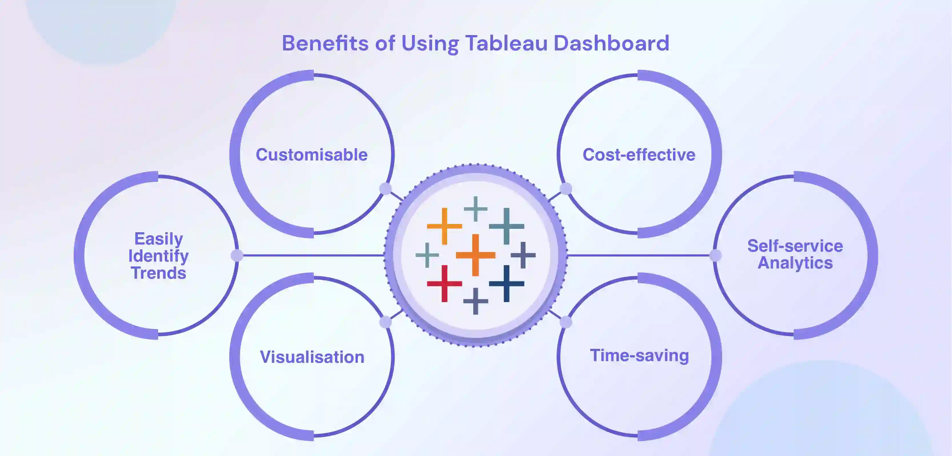
Dashboards provide organisations with an efficient way to monitor key performance indicators and gain insights into their data that can be used to make informed decisions.
Here are some of the key benefits of using Tableau Dashboards:
1. Easily Identify Trends
With Tableau Dashboards, you can quickly identify trends within your data and gain insights into how it impacts your business. This can help you make more informed decisions and understand how to adjust your strategy based on the most up-to-date information.
2. Customisable
Tableau Dashboards are highly customisable, allowing users to customise the look and feel of the dashboard to meet their specific needs. This will enable users to focus on the most critical aspects of their data and quickly access the information they need.
3. Visualisation
Tableau Dashboards allow users to visualise their data interactively and intuitively quickly. This helps users identify patterns and trends in their data and better understand how the data impacts their business decisions.
4. Time-saving
Tableau Dashboards allow users to quickly and easily analyse, visualise, and interpret their data. This saves time and energy, allowing organisations to make faster and more informed decisions.
5. Cost-effective
Tableau Dashboards are cost-effective and easy to deploy and maintain. This helps organisations save money and resources, allowing them to focus on other aspects of their business.
6. Self-service analytics
Tableau Dashboard lets users easily connect to data sources, create and publish their analyses, and share insights with others. This allows for more widespread adoption of data-driven decision-making within an organisation.
7. Access to large data sets
Tableau Dashboard can connect to various data sources, including spreadsheets, databases, and cloud services. This allows users to quickly analyse large data sets and gain insights that would otherwise be difficult to uncover.
8. Collaboration and sharing
Tableau Dashboard allows multiple users to work on the exact data visualisation and collaborate on creating dashboards and reports. It also allows easy sharing of the visualisations and dashboards within the organisation.
9. Mobility
Tableau's mobile capability allows you to access your data and visualisations on the go, with the ability to publish to Tableau Server and Tableau Online, allowing for easy access for users.
10. Variety of visualisation types
Tableau supports various visualisation types like Maps, scatter plots, heat maps, and many more, which helps users to represent the data in a much more meaningful way.
Tableau Dashboards are cost-effective, easy to deploy and maintain, and time-saving, making them an excellent choice for organisations looking to understand their data better.
Components of Tableau Dashboards
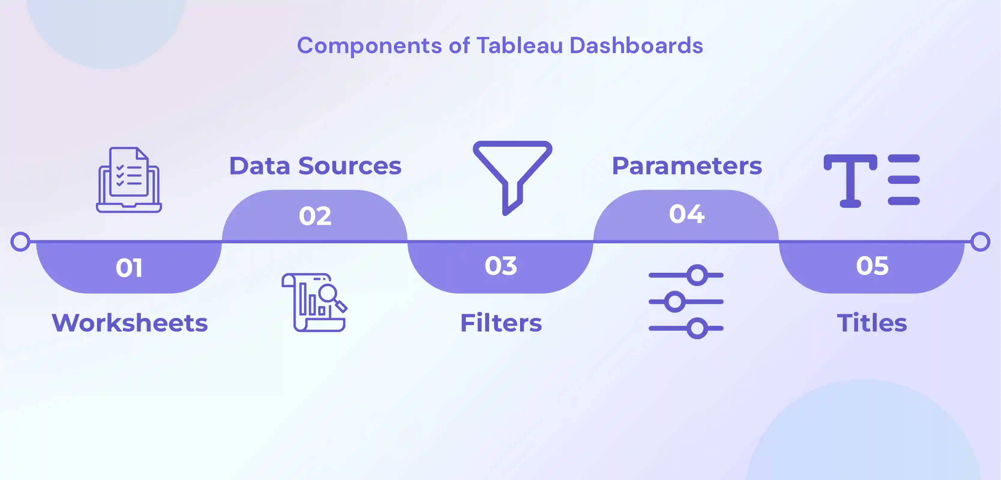
Tableau Dashboards are made up of a variety of components, which include:
1. Worksheets
Worksheets are the building blocks of Tableau dashboards. They are used to create visualisations, such as charts, graphs, and maps. Each worksheet can contain one or more visualisations, and multiple worksheets can be combined to create a dashboard.
2. Data Sources
Tableau can connect to various data sources, such as spreadsheets, databases, and cloud services. The data source is the foundation of the visualisation, where the data used to create the worksheets and dashboards is stored.
3. Filters
Filters are used to control the data that is displayed on a worksheet or dashboard. They allow you to select specific data to include or exclude from visualisation and can be used to create interactive dashboards that enable users to explore the data.
4. Parameters
Parameters are like global filters that can be used in multiple worksheets and dashboards. They allow you to adjust a value in a calculation or filter, propagating throughout the workbook and changing the final results.
5. Legends
Legends are used to provide information about the data in a visualisation. They usually include a colour key and labels that describe the data being shown.
6. Titles
Titles provide context and identify the worksheets or dashboards. A title should be short and descriptive to give a clear idea of what the worksheet or dashboard is displaying.
7. Dashboard objects
Tableau Dashboard objects include text, shapes, and images, which can add additional context and information to the dashboard, such as headers, labels, captions, or images.
8. Tooltips
These small pop-up windows appear when a user hovers over a data point on a visualisation. They provide additional information about the data and can help users understand the context of the data.
9. Actions
Actions are interactive features that allow users to navigate between worksheets and dashboards or to drill down into the data. They can be used to create links between different worksheets or to filter data based on user interactions.
10. Dashboard layout containers
Tableau provides different layout container options like horizontal, vertical, tiled, floating, and custom, which allows you to control how the worksheets are displayed on the dashboard. These containers help you to organise the visualisations and arrange them in an easy-to-read format.
These are some of the most common components of Tableau dashboards. Still, there are other advanced features and functionalities available in Tableau that can be used to create more complex and sophisticated dashboards.
Understanding Tableau Dashboards

Tableau dashboards are a way to display and interact with data using various visualisation techniques, such as charts, graphs, and maps.
Tableau dashboards are compelling because they allow you to connect to multiple data sources and combine them into a single view. This means you can create a holistic view of your data, regardless of where it's stored.
These are highly customisable and can be designed to suit different purposes and audiences.
For example, you can create dashboards for specific departments, such as sales or marketing, or different data types, such as financial or operational data. Additionally, you can make dashboards interactive, allowing users to filter, drill down, and explore the data in more detail.
When creating a Tableau dashboard, it is crucial to remember the information you want to communicate and the audience you are targeting.
For example, an executive dashboard will have a different design and layout than an operational dashboard. Understanding the audience and their information needs help in deciding on visualisations, design elements and layout of the dashboard.
Design principles such as alignment, contrast, repetition, and proximity are also important when creating a Tableau dashboard. These principles help guide the placement and organisation of elements on the dashboard, making it easy to read and understand.
Tableau dashboards are a powerful way to visualise and interact with data, connecting multiple data sources, customising the design and layout to suit different purposes and audiences, and using design principles for effective data communication.
The result is an intuitive and highly interactive way of exploring and understanding data, helping you make informed decisions based on your data.
Get Inspired by Tableau Dashboard Examples
To make data analysis work well for a company, it's essential to have good ideas for dashboards. Dashboard design should follow best practices. These examples of Tableau dashboards will show how data analysis can be used and help you understand essential business numbers.
In this section, we will discover the best tableau dashboards.
Best Tableau Dashboard Examples
This section will showcase some of the best Tableau dashboard examples to demonstrate the breadth and depth of what is possible with this powerful tool.
From sales analytics and business intelligence to social media monitoring and healthcare research, these examples will inspire your data visualisation projects, whether you are a beginner or an expert.
It's also an excellent opportunity to learn from the best how data visualisation experts use Tableau to create effective, user-friendly dashboards.
You can also take inspiration for tableau dashboard designs from these examples. Let’s jump to tableau examples.
Sales Analytics Tableau Dashboard Examples
1) E-commerce Sales Dashboard
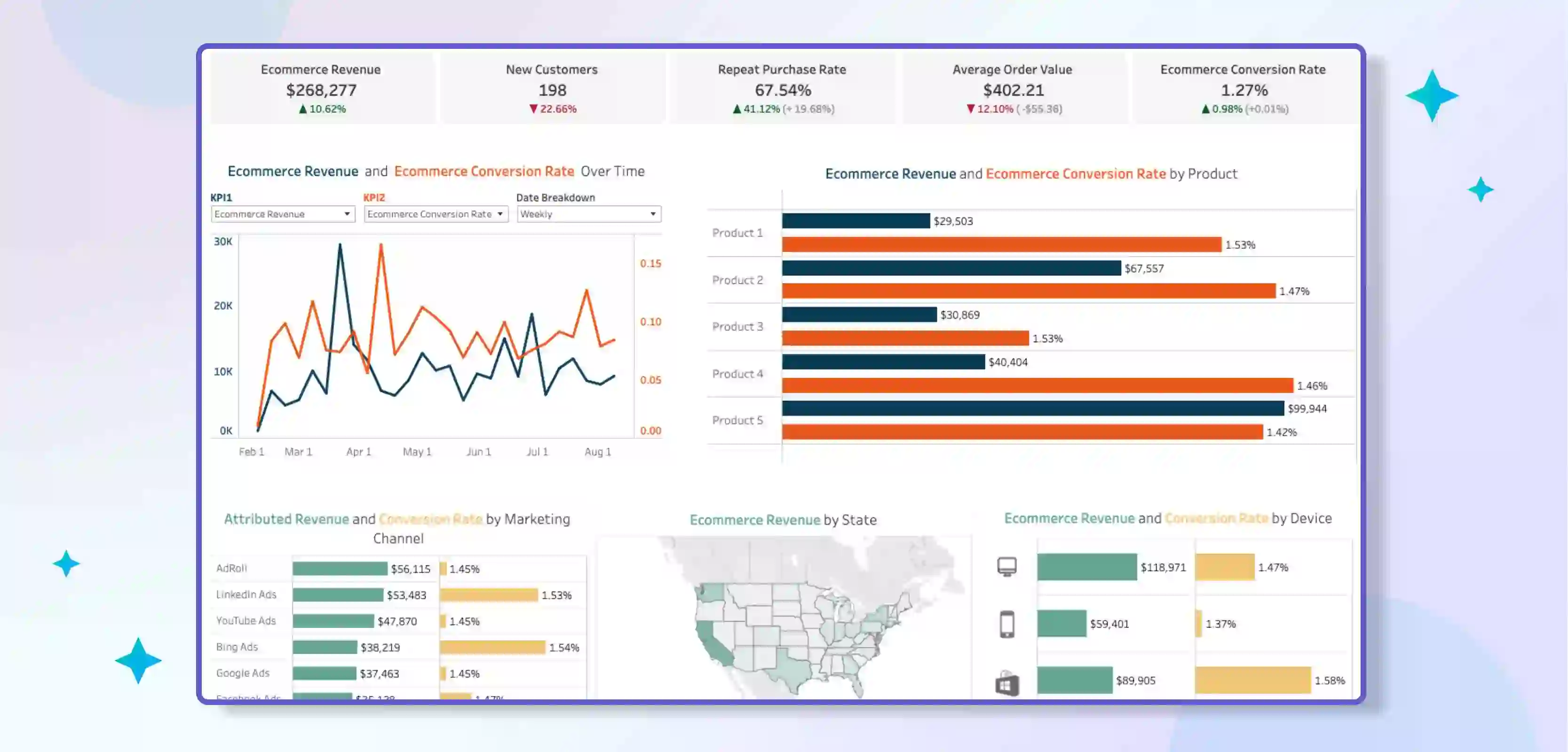
This is designed to help e-commerce businesses track and analyse their sales data. It includes visualisations that show key metrics such as total revenue, conversion rate, and average order value.
The dashboard may also include visualisations that break down sales by product category, customer segment, and geographic location.
This dashboard can help e-commerce businesses identify trends and patterns in their sales data and make data-driven decisions about product pricing, marketing, and inventory management.
2) Regional Sales Dashboard

This is designed to help businesses track and analyse sales data by geographic region. It includes visualisations that show key metrics such as total revenue, sales growth, and market share by region.
The dashboard may also include visualisations that break down sales by product category, customer segment, and time period. This dashboard can help businesses identify regional trends and patterns in their sales data and make data-driven decisions about sales strategy, marketing, and resource allocation.
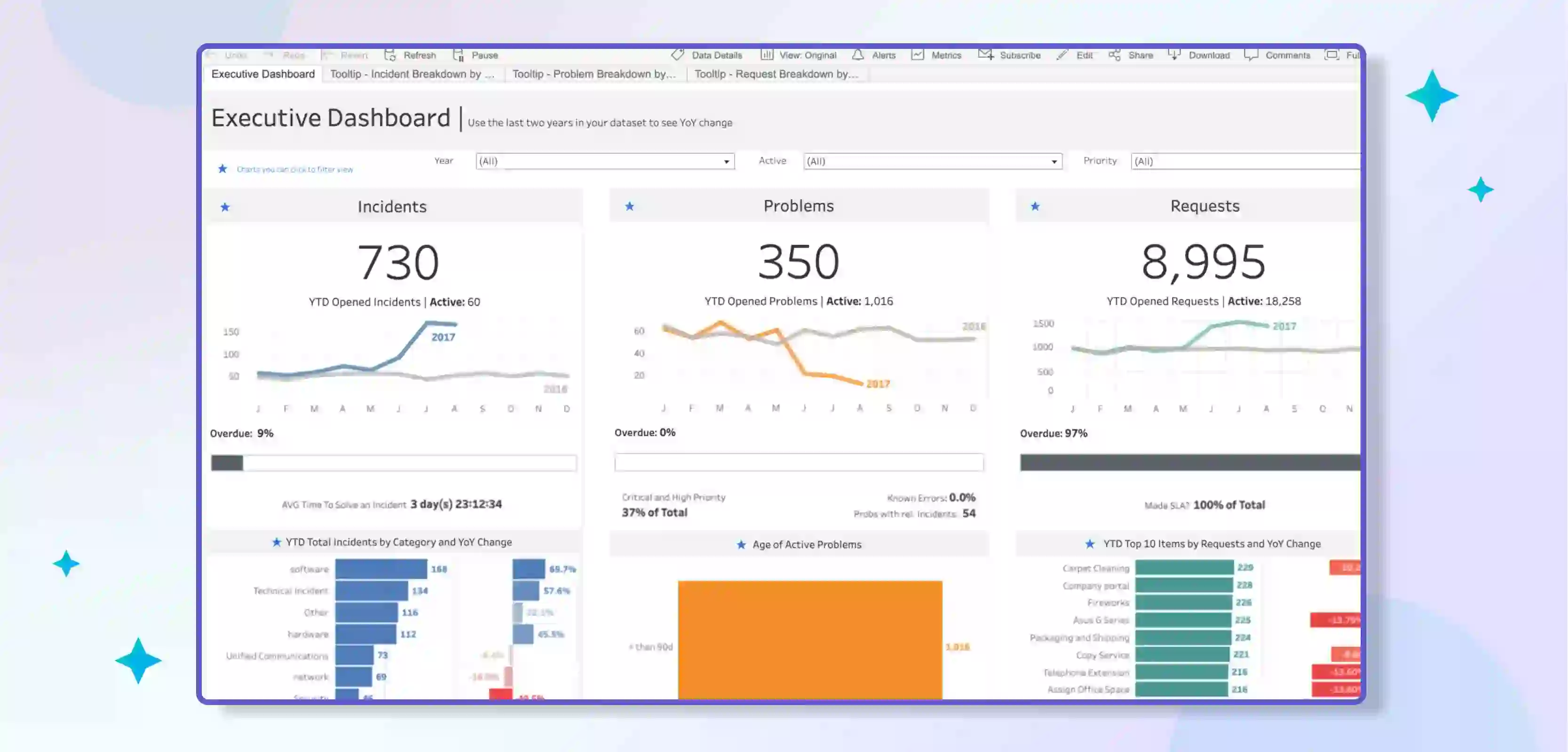
3) Executive Sales Dashboard

This is designed to provide an overview of key sales metrics for executive-level stakeholders. It includes visualisations that show total revenue, sales growth, and key performance indicators such as gross margin and customer acquisition cost.
The dashboard may also include visualisations showing trends and sales data patterns over time and comparisons to industry benchmarks or company goals. This dashboard can help executives make data-driven decisions about strategy, budgeting, and resource allocation.
4) Sales Pipeline Dashboard

This is designed to help businesses track and analyse the progression of potential sales through the sales process.
It includes visualisations that show the number of leads, opportunities, and closed deals at each stage of the pipeline and conversion rates between stages.
The dashboard may also include visualisations that show the average deal size and time to close for each stage and an overview of sales performance by the sales rep or team. This dashboard can help businesses identify bottlenecks in their sales process and optimise their sales strategy, resource allocation, and sales coaching.
Sales analytics Tableau Dashboards provide an interactive and user-friendly way of tracking and analysing sales data, helping businesses make informed decisions on sales strategy, marketing, resource allocation and inventory management.
Each of the above examples provides a specialised view of sales data and helps businesses to gain different insights into their sales performance.
Marketing Analytics Tableau Dashboard Examples
1) Marketing Funnel Dashboard

This type of Tableau dashboard is designed to help businesses track and analyse the performance of their marketing campaigns. It includes visualisations that show key metrics such as website traffic, conversion rate, and customer acquisition cost at each marketing funnel stage.
It also contains visualisations that show how different channels, such as email, social media and search engines, drive traffic and conversions across the funnel stages.
The dashboard can also help businesses identify trends and patterns in their marketing data and make data-driven decisions about marketing strategy, budgeting, and targeting.
2) Social Media Tracking Dashboard
This is designed to help businesses track and analyse their social media performance. It includes visualisations that show key metrics such as follower count, engagement rate, and reach for each of their social media channels.
The dashboard may also include visualisations that show the performance of individual posts, campaigns, or hashtags over time. It also indicates how social media performance relates to other business metrics, such as website traffic and revenue.
This dashboard can help businesses identify trends and patterns in their social media data and make data-driven decisions about social media strategy, content creation, and community management.
Marketing Analytics Tableau Dashboards provide an interactive and user-friendly way of tracking and analysing marketing data, helping businesses make informed decisions on their marketing strategy, budgeting, targeting, and community management.
Each of the above examples provides a specialised view of marketing data and helps businesses to gain different insights into their marketing performance.
The Marketing Funnel Dashboard helps identify other channels' performance at various stages of the funnel. At the same time, the Social Media Tracking Dashboard provides insights on how to optimise their social media strategies.
Customer Service Tableau Dashboard Examples
1) Helpdesk Ticketing Dashboard
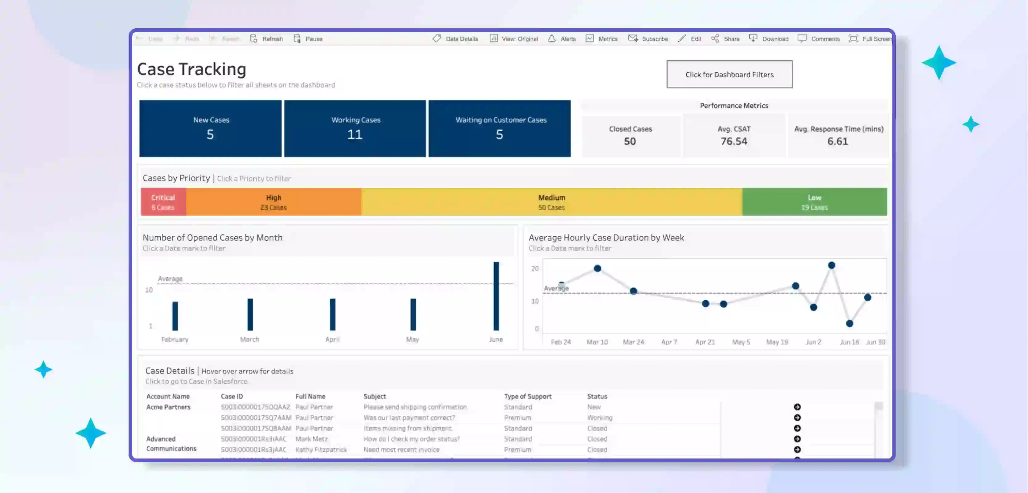
This is designed to help customer service teams track and analyse the volume and resolution of customer support requests, commonly known as helpdesk tickets.
It includes visualisations that show key metrics such as the number of open tickets, ticket volume by category, and ticket resolution time. The dashboard may also include visualisations that break down ticket volume by customer segment, such as new vs returning customers, or by geographic region.
This dashboard can help customer service teams identify trends and patterns in their ticket data and make data-driven decisions about resource allocation, ticket routing, and process improvement.
2) Helpdesk Team Performance Dashboard
This Tableau dashboard is designed to help customer service teams track and analyse the performance of individual agents and teams. It typically includes visualisations that show key metrics such as average handle time, customer satisfaction scores, and ticket resolution rate.
The dashboard may also include visualisations that break down agent performance by ticket category, customer segment, or time period. This dashboard can help customer service managers identify trends and patterns in agent performance and make data-driven decisions about coaching, training, and performance management.
Customer Service Tableau Dashboards provide an interactive and user-friendly way of tracking and analysing customer service data, helping teams make informed decisions on resource allocation, ticket routing, process improvement, coaching, and training.
The Helpdesk Ticketing Dashboard helps to understand the volume of tickets and the time required to resolve them. At the same time, the Helpdesk Team Performance Dashboard provides insights on how to optimise the performance of individual agents and teams.
Financial Analytics Tableau Dashboard Examples
1) Profit and Loss Dashboard

This is designed to help businesses track and analyse their financial performance. It includes visualisations that show key metrics such as revenue, expenses, and net profit over time.
The dashboard may also include visualisations that break down revenue and expenses by product category, customer segment, or geographic region. This dashboard can help businesses identify trends and patterns in their financial data and make data-driven budgeting, forecasting, and financial planning decisions.
2) Employee Expense Analysis Dashboard

This is designed to help businesses track and analyse employee expenses. It typically includes visualisations that show key metrics such as total expenses, average expense per employee, and top expense categories.
The dashboard may also include visualisations that break down employee expenses by department, time period, or type of expense (e.g., travel, training, etc.).
This dashboard can help businesses identify trends and patterns in employee expenses and make data-driven decisions about cost management, budgeting, and employee policies.
3) Accounts Receivable Analysis Dashboard

This dashboard is designed to help businesses track and analyse their accounts receivable and the amounts of money customers owe to the company.
It includes visualisations that show key metrics such as the total amount of receivables, the average time it takes to collect payments, and the percentage of customers who are late on their payments.
The dashboard may also include visualisations that break down accounts receivable by customer segment, industry, or credit risk. This dashboard can help businesses identify trends and patterns in their accounts receivable data and make data-driven decisions about credit policies, collections, and cash flow management.
4) Account Management 360 View Dashboard

This type of Tableau dashboard is designed to provide a comprehensive view of a company's customer data. It includes visualisations that show the overall health of a company's customer base and allows managers to see the financial performance of each customer, sales and purchase history, product or service mix, and other essential data.
The dashboard allows us to identify trends and patterns of customer behaviour and make data-driven decisions about sales, marketing, and customer service.
Financial Analytics Tableau Dashboards provide an interactive and user-friendly way of tracking and analysing financial data, helping businesses make informed decisions on budgeting, forecasting, financial planning, cost management, cash flow management, sales, marketing, and customer service.
Each of the above examples provides a specialised view of financial data and helps businesses to gain different insights into their financial performance.
These are some of the tableau reporting examples.
Miscellaneous Tableau Dashboard Examples
1) Super Sample Superstore Dashboard
This is a sample tableau dashboard provided by Tableau itself. It's designed to show the capability and flexibility of the software. It's a retail dashboard that offers a variety of visualisations such as Sales and profit by category, by sub-category, by region and by year.
It also visualises customer demographics, market trends, and shipping and handling. This dashboard is a good starting point for beginners, as it showcases various functionalities of Tableau and can be used as a template for creating their dashboards.
2) Healthcare Data Dashboard
This is designed to help healthcare organisations track and analyse patient and operational data. It typically includes visualisations that show key metrics such as patient demographics, patient flow, and resource utilisation.
The dashboard may also include visualisations that break down data by facility, department, or provider. This dashboard can help healthcare organisations identify trends and patterns in their data and make data-driven decisions about staffing, resource allocation, and quality improvement.
3) Promotional Optimization Dashboard
This type of Tableau dashboard is designed to help organisations track and analyse the performance of their promotional campaigns. It includes visualisations that show key metrics such as conversion rate, customer acquisition cost, and ROI for each campaign.
The dashboard may also include visualisations that break down campaign performance by channel, product category, or customer segment. This dashboard can help organisations identify trends and patterns in their promotional data and make data-driven decisions about marketing strategy, budgeting, and targeting.
Miscellaneous Tableau Dashboards demonstrate the wide range of use cases for Tableau. It can be used for different types of data and industries.
The Super Sample Superstore Dashboard is an example of retail data, the Healthcare Data Dashboard is an example of the healthcare industry, and the Promotional Optimization Dashboard is an example of marketing analysis.
These examples are a great way to understand how Tableau can analyse and visualise data and make informed decisions. I hope you get some tableau dashboard ideas from these examples.
Tableau: Limitless Dashboard Possibilities
These tableau templates are suitable for common uses in different departments like marketing and sales. But there are many other types of dashboards that you can create in Tableau, like
- Human resources dashboard to track employee performance
- Workflow dashboard to manage project progress
- A dashboard for customer relationship management data
- A forecast dashboard to predict future sales
- A dashboard to optimise promotions
- A dashboard to recommend actions based on data analysis
- A sales pipeline dashboard to track leads
- A healthcare data dashboard to analyse medical information
Tableau dashboards can improve a company's operations. And with tools like Coefficient, you can use the data more by integrating it with Google Sheets. Reverse ETL is a new trend that makes BI dashboards work better with actionable data.
Simplify your Tableau Data Analysis using Boltic’s No-code Data Pipelines
Boltic's No-code Data Pipelines is a platform that aims to simplify Tableau data analysis by making it easy to build and orchestrate data pipelines without needing to write code. By using this platform, businesses can collect, process, and analyse large data sets in a more efficient and streamlined manner.
Using Boltic’s no-code data pipelines, data can be easily ingested from various sources and then transformed, cleaned and curated, ready for analysis in Tableau. This can save time and resources, eliminating manual data preparation and allowing for faster insights.
Boltic’s no-code data pipelines enable scheduling data refreshes and monitoring the data pipeline, ensuring that the data is always up to date and accurate in Tableau.
It also allows sharing of the data pipeline and visualisations within the organisation. All this could be achieved with a user-friendly UI which makes it very easy to understand and use.
In short, Boltic's No-code Data Pipelines can simplify the process of analysing data in Tableau by automating repetitive tasks, providing easy data pipeline management, and streamlining data preparation, thus saving time and resources.
Benefits of using Boltic
Boltic is a platform that aims to simplify data analysis by providing a no-code solution for building and orchestrating data pipelines. The benefits of using Boltic include the following:
1. No-code Data Pipelines: It allows you to build and orchestrate data pipelines without needing to write code, making it easy for businesses of all sizes to collect, process, and analyse large data sets.
2. Data Ingestion: It supports various data sources, making it easy to ingest the data, thus saving time and resources.
3. Data Transformation: Data ingested can be easily transformed, cleaned and curated, ready for analysis in Tableau, eliminating manual data preparation and allowing for faster insights.
4. Data pipeline management: Boltic enables you to schedule data refreshes, monitor the pipeline, and ensure that the data is always up-to-date and accurate in Tableau.
5. Collaboration and sharing: Boltic allows sharing of the data pipeline and visualisations within the organisation, facilitating teamwork and knowledge sharing.
6. User-Friendly UI: User-friendly and easy-to-understand UI makes it easy for non-technical users to build and manage data pipelines.
7. Scalability: Platform designed to handle large amounts of data, making it suitable for businesses of all sizes.
8. Cost-effective: With a no-code solution, it eliminates the need for hiring data engineers, which could be expensive and hard to find, thus making it a cost-effective solution for businesses.
Conclusion
Tableau dashboards are an essential tool for visualising and analysing business data. They can be used in various departments, such as marketing and sales, to improve operations and make data-driven decisions.
Tableau dashboards can be customised to fit specific use cases, such as forecasting and promotional optimisation. With the help of tools like Coefficient, you can integrate Tableau data with Google Sheets for even more functionality.
To successfully implement data analytics in a company, it is essential to have a good dashboard design, follow the best practices and have inspiration from different examples.
drives valuable insights
Organize your big data operations with a free forever plan
An agentic platform revolutionizing workflow management and automation through AI-driven solutions. It enables seamless tool integration, real-time decision-making, and enhanced productivity
Here’s what we do in the meeting:
- Experience Fynd Boltic's features firsthand.
- Learn how to automate your data workflows.
- Get answers to your specific questions.